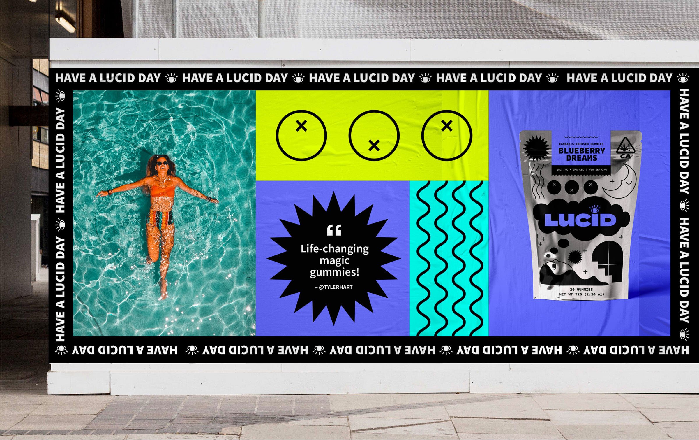
Have a Lucid Day
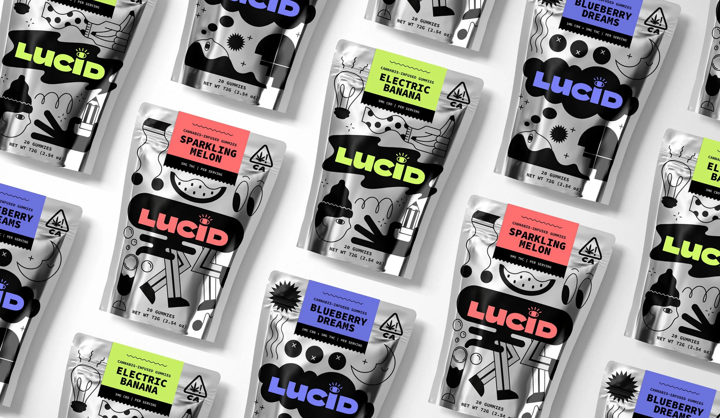
Based in sunny California, Lucid is an edible cannabis company that is on a mission to brighten people’s lives and make cannabis more accessible to everyone. They aim to break through the misconceptions associated with cannabis – the stigma, the side effects, the usage – to open our eyes to the possibilities and benefits that cannabis can bring to our daily life.
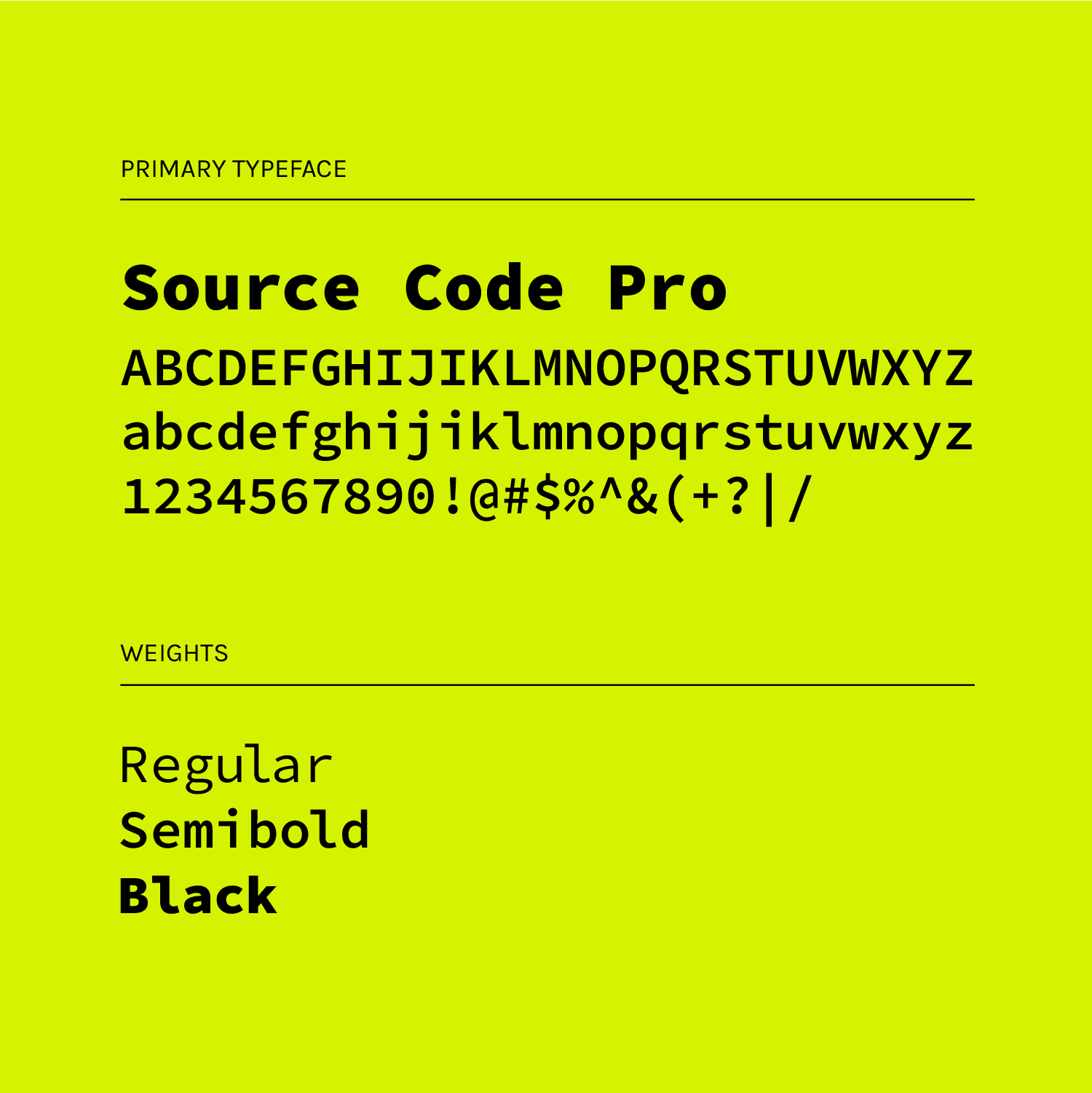
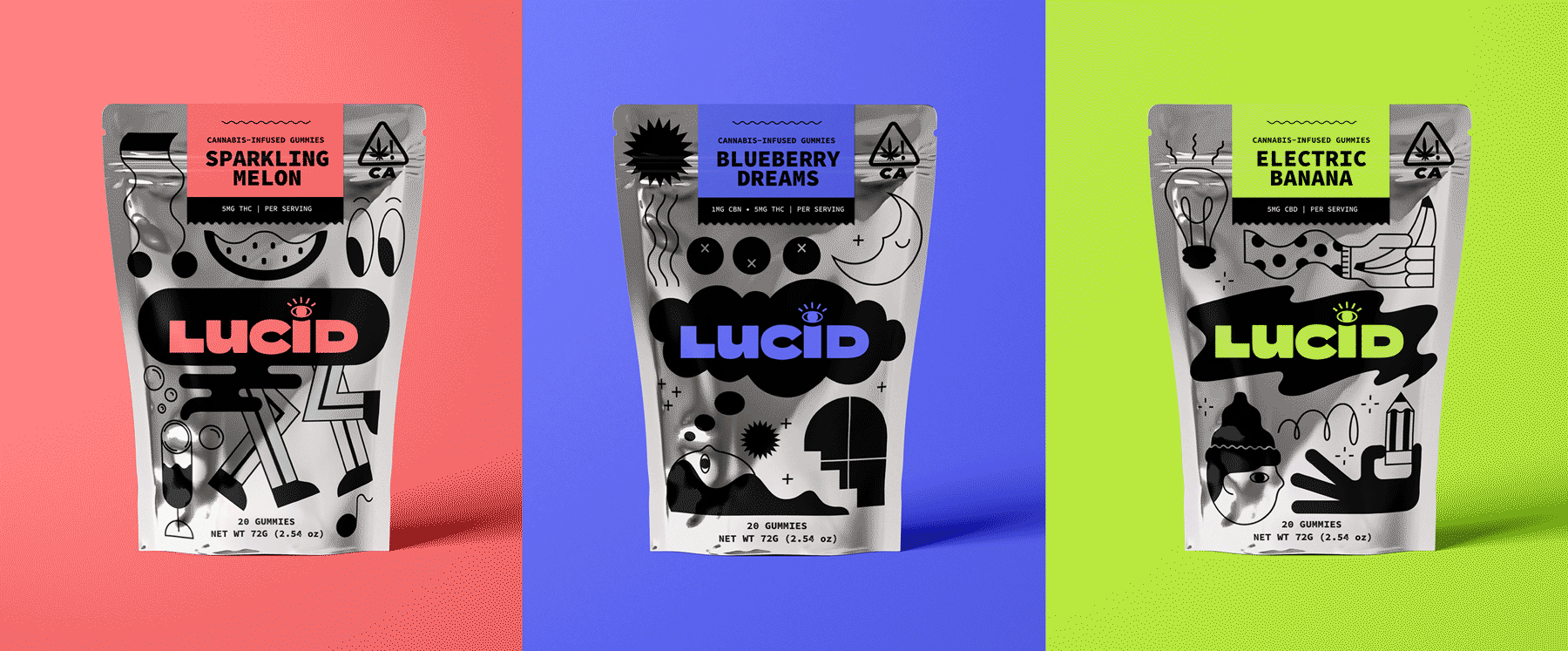
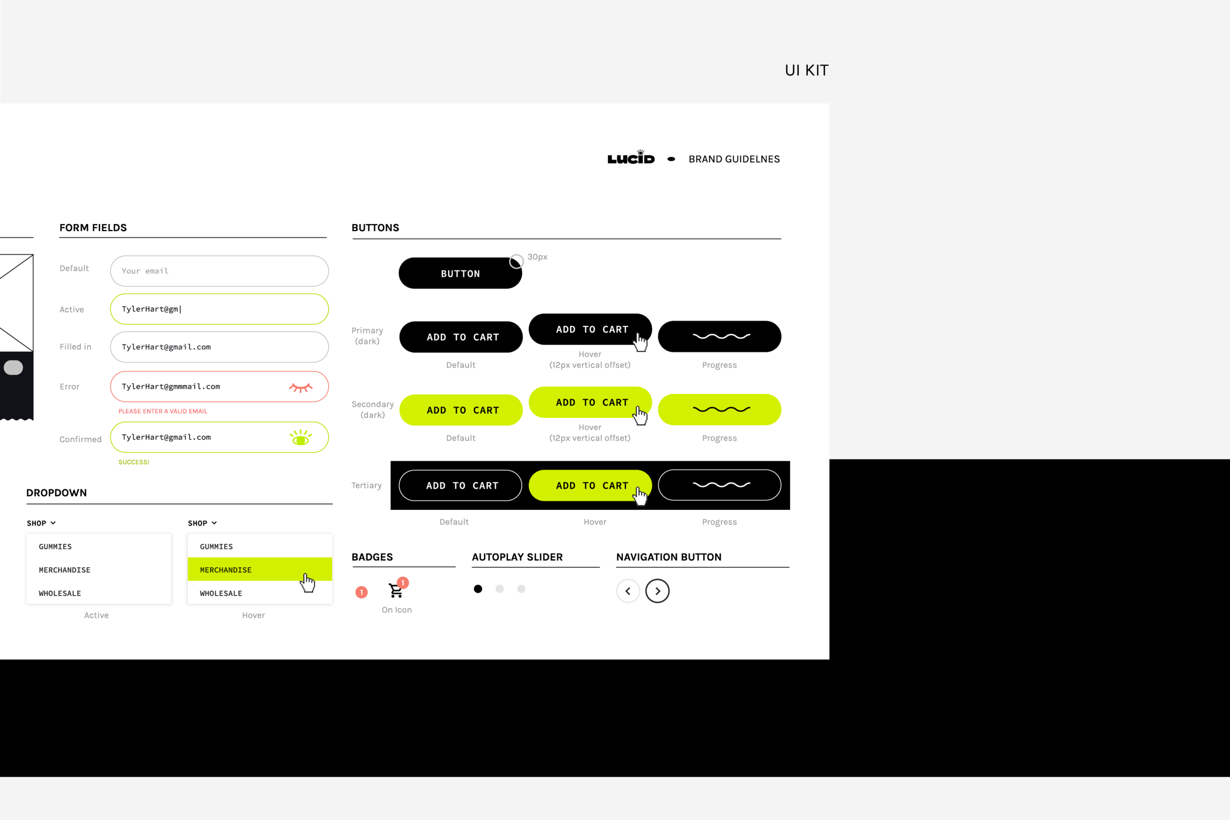
In order to support this messaging, the brand moments had to be both approachable and bold, technical yet quirky. To speak to these dualities, Source Code Pro was the perfect primary typeface. Its structure is robust and modern enough to deliver the company’s bold messaging to its tech-savvy consumers, while its serifs surprise us with some unexpected quirkiness, bringing friendly vibes to the brand voice. The metallic silver of the packaging paired with Lucid’s signature illuminating colors and illustration-focused design helps Lucid stand out from the crowd and highlights the flexibility in the experience of each gummy. In addition, the artful approach to the packaging also influences the collectibility of the bags; making it more likely for each flavor to be tried and shared through social media.
The result is an energetic, inviting, and uplifting design system that challenges the perception of cannabis and inspires the world to a new way of living - bringing out the extraordinary, in the ordinary.
Project Scope
— Art Direction
— Branding
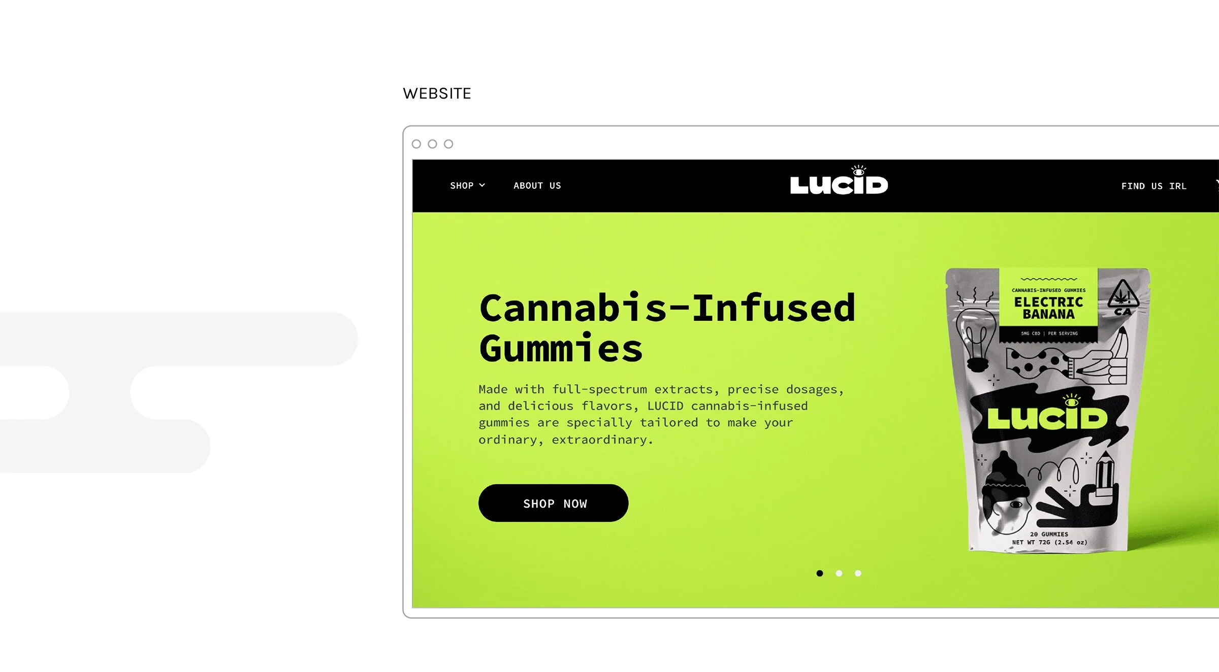
— UI
— Packaging
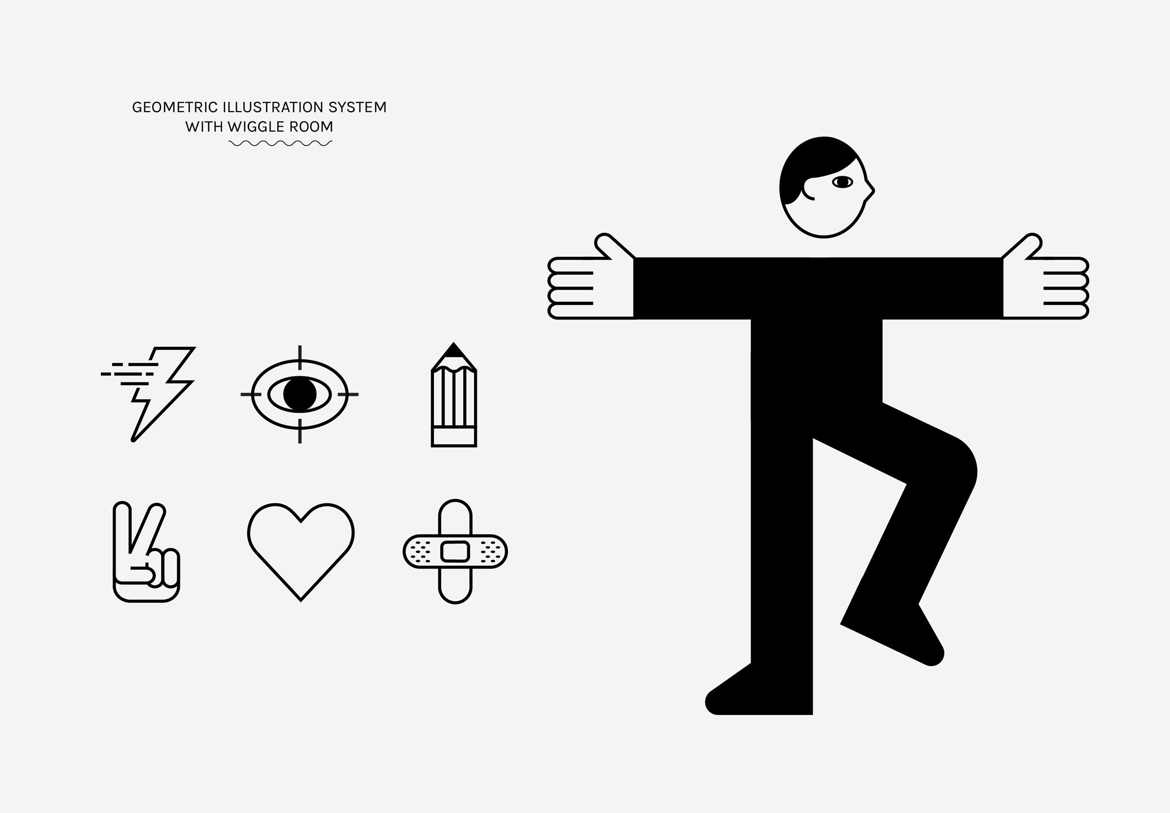
— Illustration