Evolving Grammarly’s Brand Design System
When I joined the Brand Design team 3 years ago, there was only 1 in-house Brand Designer on the team and no consistent visual language or design systems in place. Since then, I helped evolve Grammarly’s visual identity by establishing brand guidelines for their core brand, employer brand, and workplace experience. I built a cohesive illustration library, defined brand colors, and partnered with the type foundry, Colophon, to create a unique typeface for Grammarly. I partner closely with our product design team to ensure a cohesive and delightful brand experience at every touchpoint.
The foundations I helped build allowed our fast-growing team and partners to design consistently at scale. From art directing integrated campaigns to leading a team of brand designers, illustrators, motion designers, and writers, I adapt to the needs of the ever-changing environment of our team—jumping in as a contributor or design lead and collaborating with cross-functional partners to ensure that the visual expression is true to the brand.
Project Scope
— Art Direction
— Design Lead
— Branding
— UI
— Packaging
— Illustration
— Environmental Design
Collaborators
— Carlos Salazar, Matt Ebling, & Ace Eichten helped us bring the motion and logo animations to life
— Matthew Wong, Christina Jung, & Nick Slater for their illustration prowess to build out our illustration library and style.
— Colophon Foundry for their work creating a custom typeface for Grammarly.


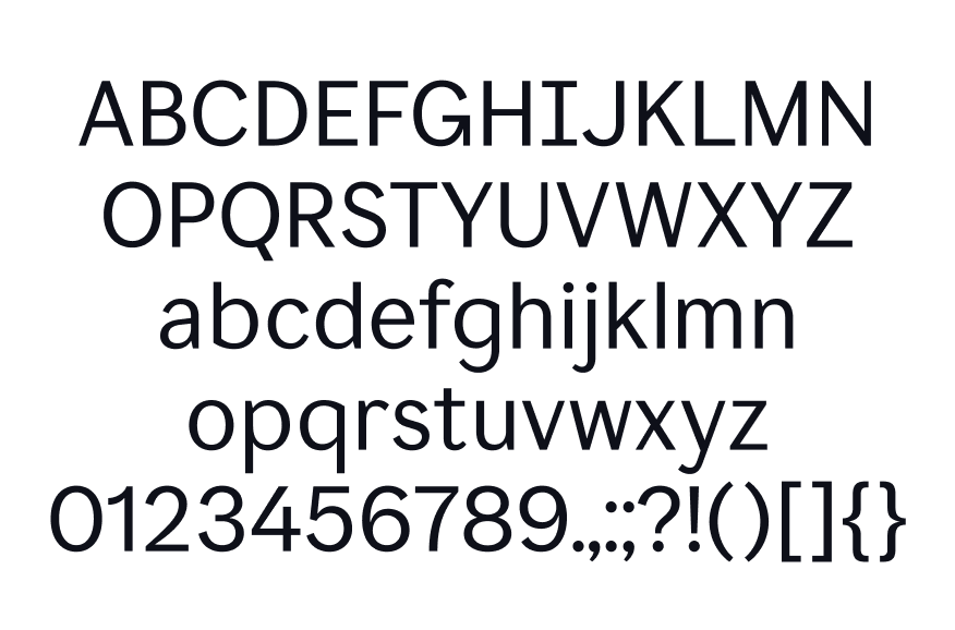
Custom Grammarly Typeface
Grammarly’s mission is to improve lives by improving communication. My team and I identified elements that are key to supporting this mission, with “inclusive and accessible” being at the forefront. From a brand design perspective, being able to communicate as intended includes optimizing visual elements from color and typefaces to be as inclusive as possible for every user’s visual needs and disabilities.
With accessibility as our north star, I was part of a small core team composed of key cross-functional partners consulting with the Colophon agency to create a unique typeface for Grammarly that would be expressive to our Brand voice, marketing needs and accessible to our users’ in-product experience. I gave feedback and insights on the typeface and guidance on how to test the typeface across all our brand experiences.


Accessible Brand Color
Our product and brand design teams did not initially have an established partnership, which resulted in inconsistent visual elements such as color, typography, and illustration across our external and in-product brand experience. Part of evolving the brand involved refreshing each of these elements. While there are colors unique to each experience, the Grammarly Green needed to be the unifying thread between all touch points. I worked closely with the Design System’s team to build a green color that would harmonize well with our existing brand design palette and serve a functional purpose within our product as well; striking a balance between delight and stress testing for accessibility.


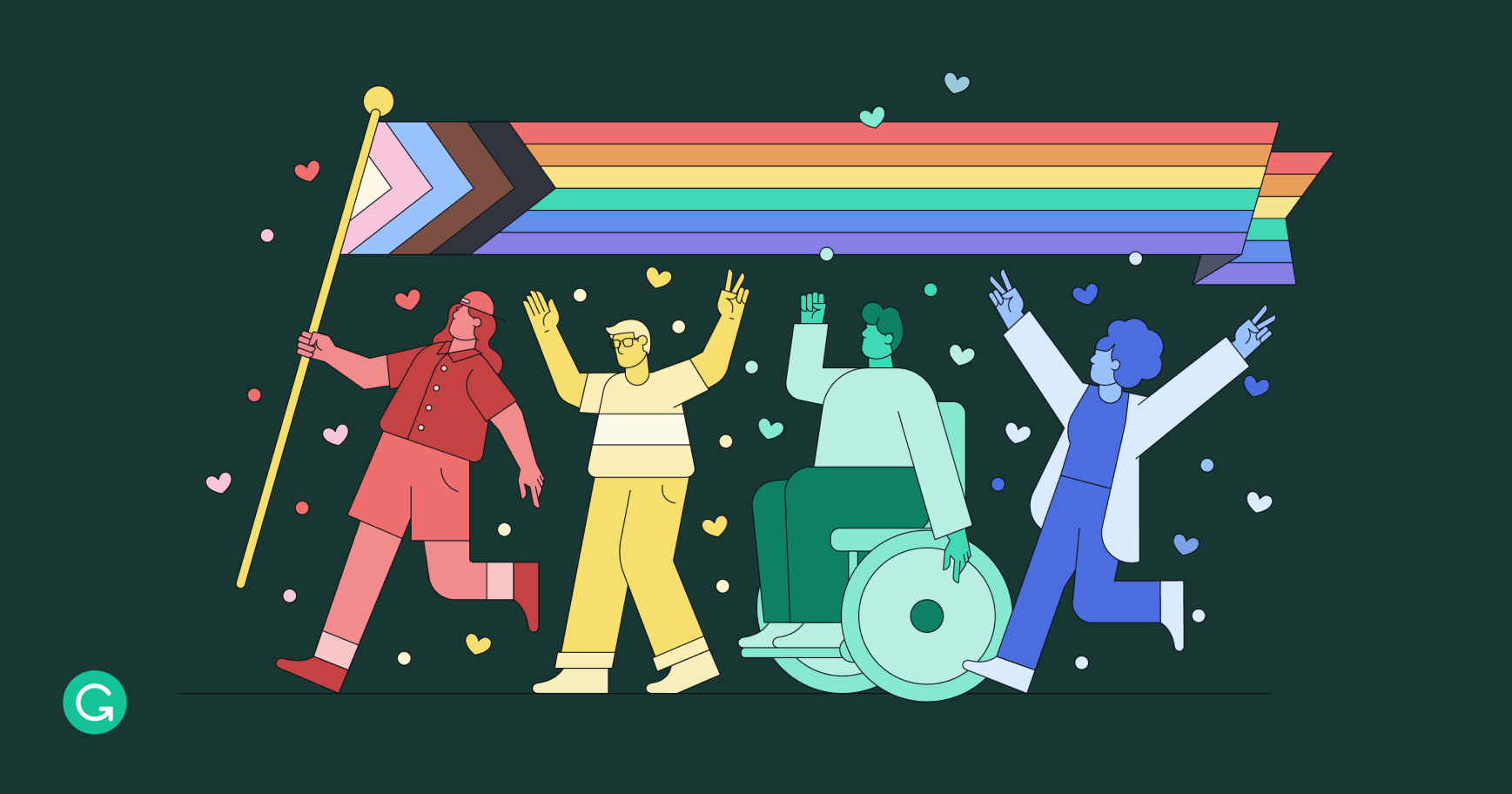
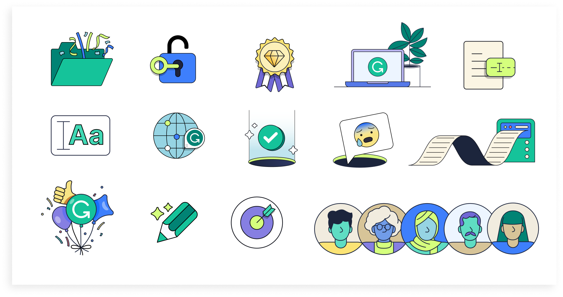
Brand Illustration
Illustrations were a core part of our brand expression, but it was lacking a consistent style. To address this, I reviewed our past and present work and commissioned the services of Illustrator Nick Slater to create a unique and unified look. I selected Nick based on his ability to adapt to a range of styles and subject matter. Together with my creative direction, we developed a library of assets that catered to all our use cases and set a standard for our brand’s illustration style.


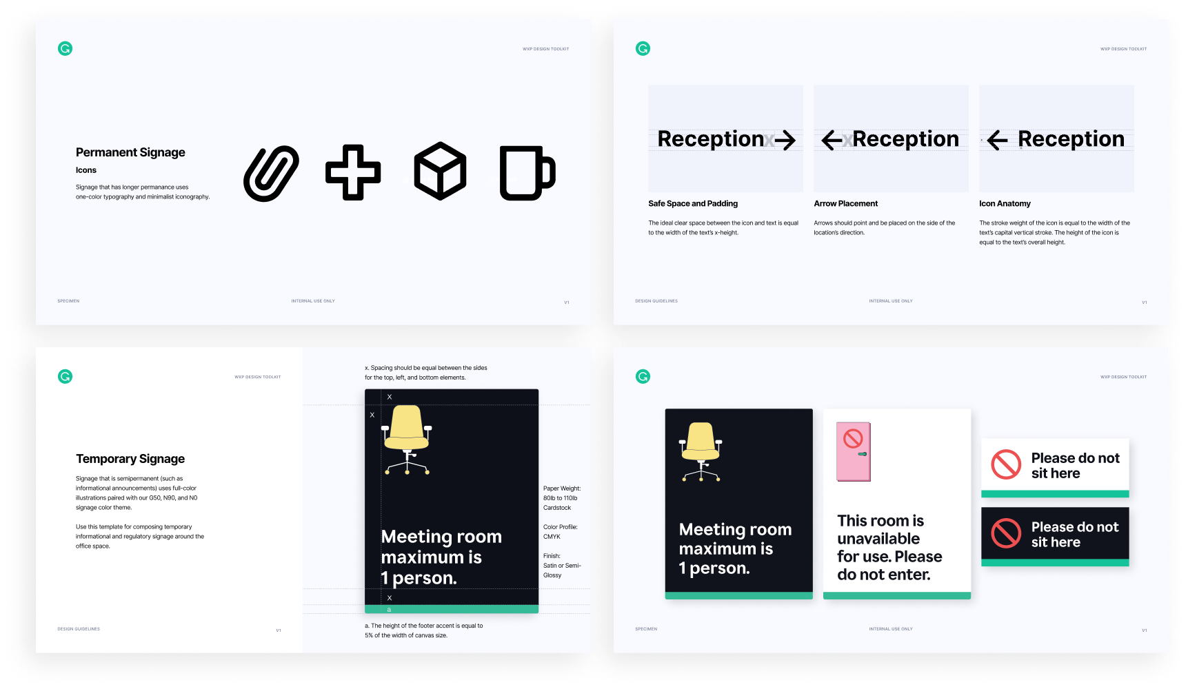
Brand Experience
Part of my role involved designing experiences for our external and internal communications. I partnered with the workplace experience team to define guidelines for how our brand could show up in a delightful way in our offices, events, and employee experience and still stay true to our brand. I was involved in every phase of the design process, from design execution to overseeing environmental builds and communicating with vendors.


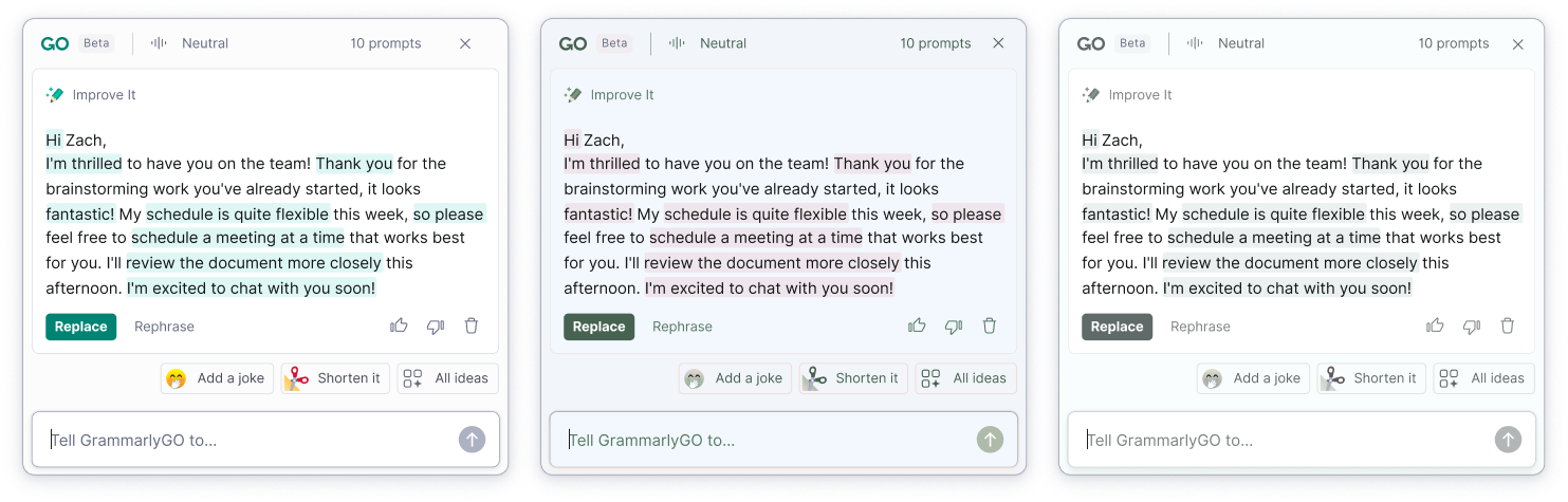
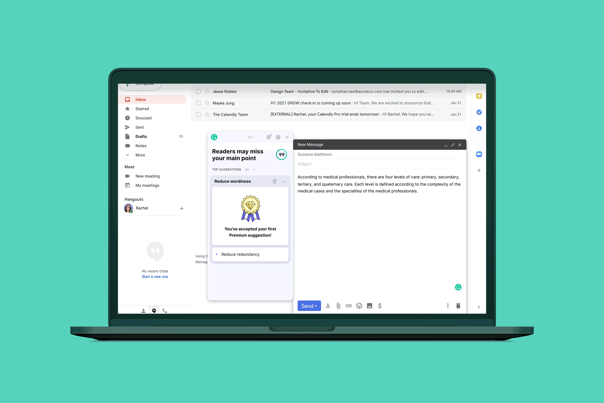
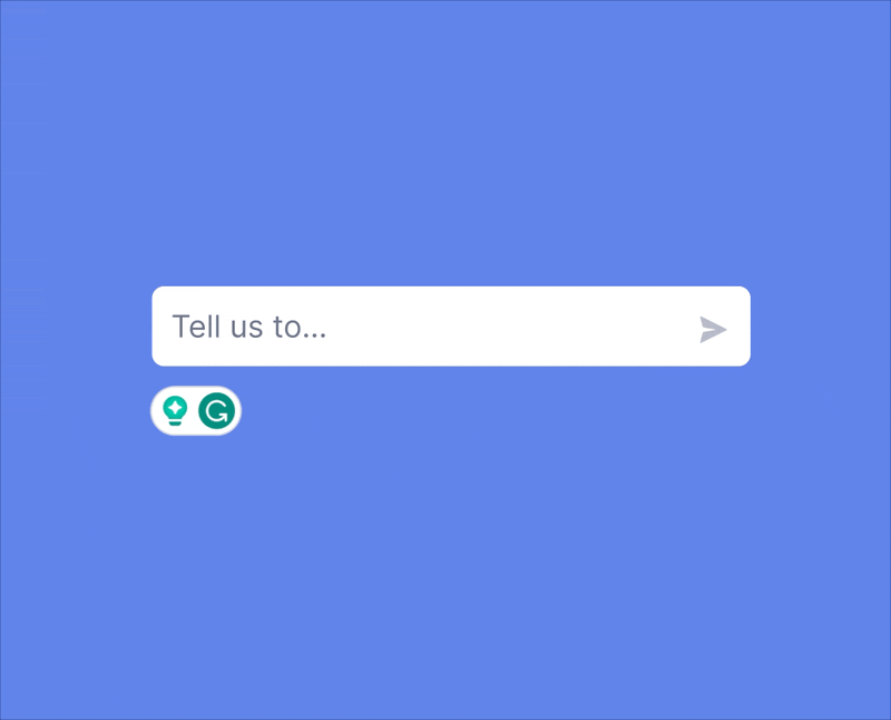
In-Product Design
Close collaboration with our Product Design team was crucial in achieving a consistent brand experience. I was the core designer in bridging the design gap between our teams by partnering closely when a common visual element was being implemented. After building our brand illustration library, I worked with the product team to translate that work into in-product-friendly assets. This involved simplifying our illustrations and adding pops of shadow to allow for depth and readability at a small scale in the product.

Product Animation
When it came to product representation in our Marketing assets, it was important to find a balance between true-to-product versus stylized depictions. I led the collaboration with our marketing stakeholders and product design team to translate what our product UIs would like for the purpose of our marketing initiatives. I then created storyboards of those UIs and provided motion direction to our motion designer to animate.


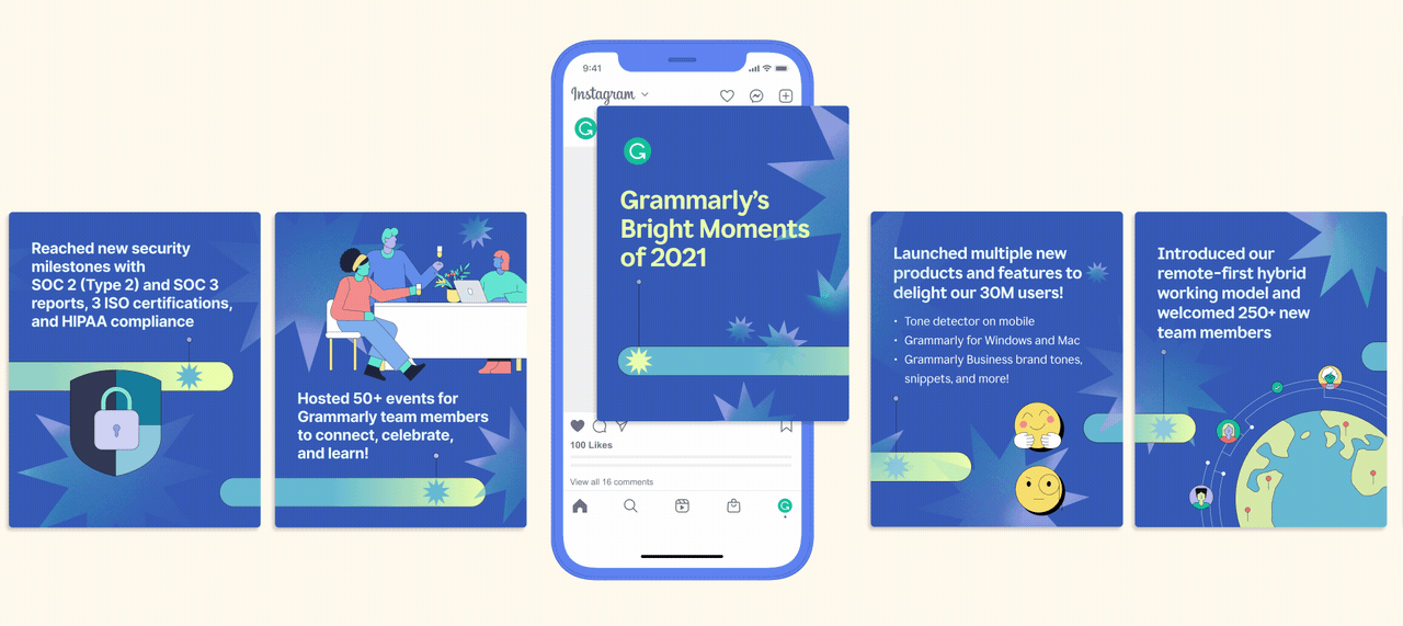
Marketing & Social Media
As a lead designer for Grammarly, my work has influenced a wide range of visuals that cater to our internal and external audiences across various touchpoints; including digital, in-person interactions, and in-product experiences.
By establishing a strong foundation, I was able to help our team scale our brand experience consistently. Here are selections of how I’ve put together the elements of our brand for various marketing projects.