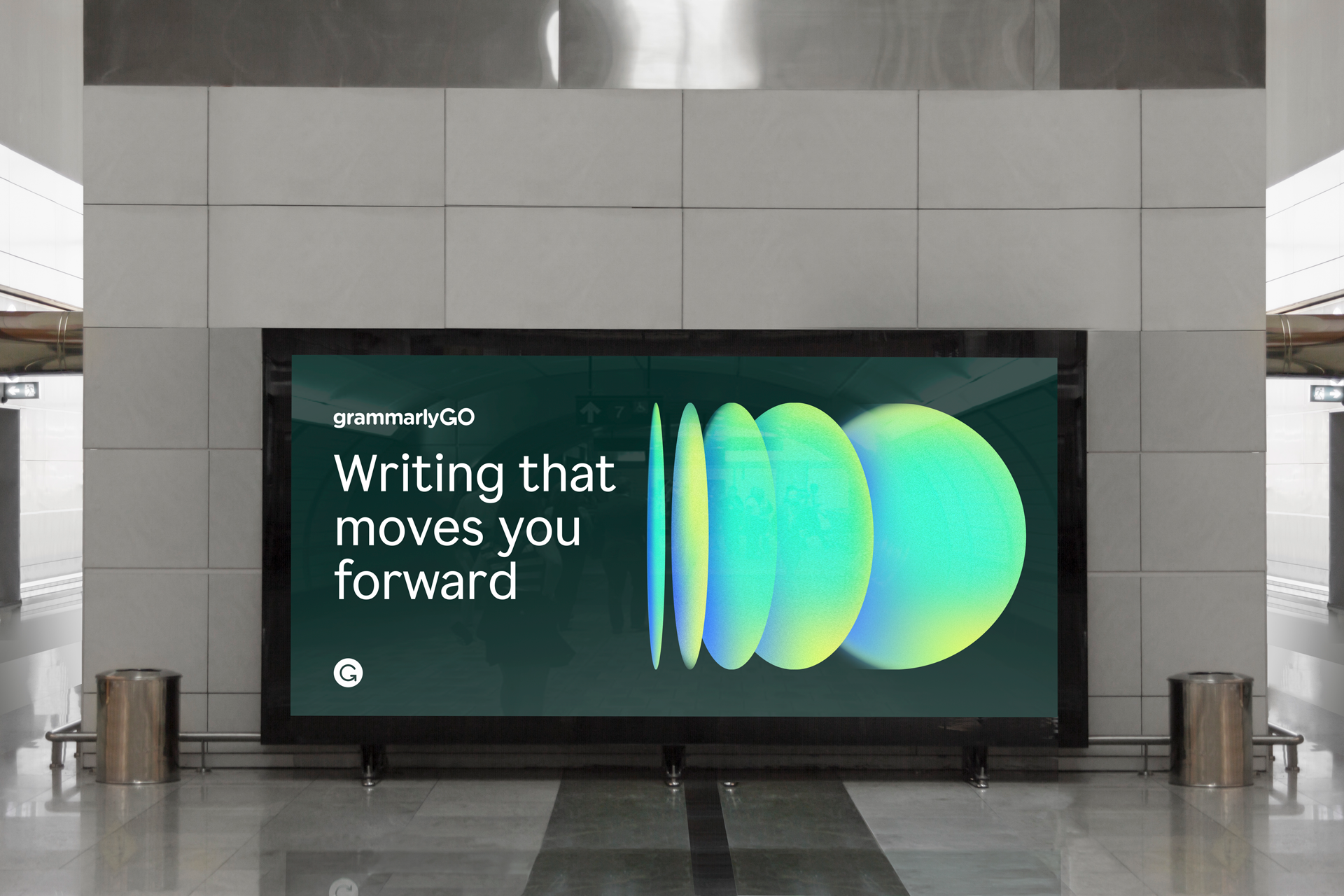
GrammarlyGO
GrammarlyGO augments human potential to further deliver Grammarly’s promise of improving lives by improving communication. At the time we were working on this new generative AI product, AI was a new, unfamiliar, and hot topic moving at a rapid pace across all industries; our team was hard at work to build, launch, and make our mark within the conversation. I led the art direction for the marketing launch of GrammarlyGO, working closely with our brand writer, Julie, to craft a narrative around the potential and interaction between humans and machines. The visual language focused on dynamically layered shapes and movement to convey the iterative and evolutionary process in thinking, writing, and creativity within humans and machines, and the layers of support behind GrammarlyGO’s generative AI.
Project Scope
— Art Direction
— Product Design
— Integrated Marketing Campaign
Collaborators
— Motion Design: Carlos Salazar & Matt Ebling
— Campaign Copy: Julie Yue


Creative Direction
Thinking, writing, and generative AI are iterative processes; each idea is built upon the previous. The evolution of shapes represent this iterative process. It’s transformative, akin to the potential of Generative AI to transform almost all aspects of business and how people work.
Compositions are layered to convey the interaction between human and machine, layers of support that GrammarlyGO will bring to users’ communication experience, and the
layers that comprise good writing: sensitivity, voice, style, and substance.
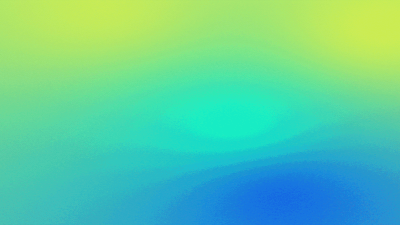
The softness of the gradients represent human qualities juxtaposed with the hard edges of the shapes representing technology. Iridescent gradients add in notions of liveliness and delight. They brighten up photography, product and messaging wherever they’re placed; representing the creative spark that GrammarlyGO will bring to users on their journey.


GO Launch Promo
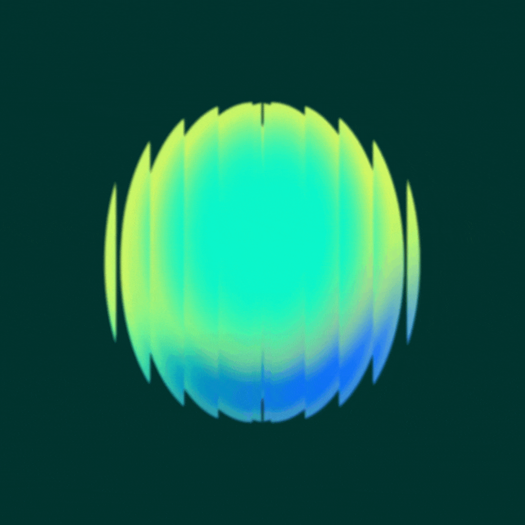
After building the art direction guidelines for the campaign, I worked closely with our motion designers on how the motion should look and feel for our launch videos. I designed a set of illustrations showing how the compositions of the orb could form in a modular way. The shifting shapes of the orb represented an abstraction of our generative AI machine working in the background, guiding and supporting our users throughout their communication journey.
Our motion designers, Carlos and Matt used these illustrations and directions as a guiding principle for how the text, UI, and shapes would move and transition from one frame to the next.